As more digital publishers rush to transform themselves into “video first” companies, the challenge to efficiently and effectively distinguish their content from the competition keeps growing.
Manhattan creative studio Versus – who’ve created online graphics packages for Vanity Fair, PeopleTV, Entertainment Weekly, and InStyle – recently took on that task for one of the most venerated news companies on the planet.
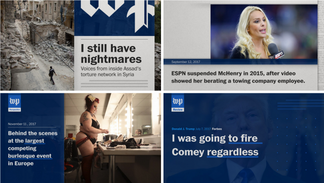
From Versus: “From a design standpoint, the Washington Post already had a strong, well-recognized brand, so Versus’ design involved graphic amplification that strengthened the brand and made it as bold as a WP editorial.

“Content needed to come first, so a graphic system needed to be created as a foundation or support system. To that end, animation needed to reflect the bold editorial of The Washington Post, carrying the story purposefully, thoughtfully and to the point, so that all words drove action.
“From a usage standpoint it was important that all toolkits were both current and future-proof structurally.
Toolkit demo 1
“They needed to be built cleanly and be multi-use and multi-platform, with unbreakable After Effects-to-Premiere integration, and non-negotiable user and brand guidelines that could be easily passed to a network of editors and producers.
Toolkit demo 2
“Versus ultimately built custom scripts and innovative tools that leveraged the Adobe Essential Graphics system, and could be completely handled and updated within the Premiere interface.
“This gave complete control to editors, eliminating the need for an After Effects artist to update and modify graphics.”
Client: Washington Post
Design/production: Versus
