Turns out HBO’s critically acclaimed and relentlessly gritty True Detective series is an anthology. So if the cast, location and narrative arcs all change each season, how do you handle the titles – especially if you won the Outstanding Main Title Design Emmy for the first season?
Elastic director/designer Patrick Clair walks us through his balancing act…
Patrick Clair: “It was clear we’d need to build a new title sequence for the return of True Detective – our original execution featured the cast and location of season 1, but this new season featured a larger cast in a completely different time and place.
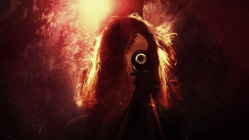
“The question was – how far do we depart from the technique of combining landscapes and footage into distorted portraits of our characters? On one hand, we didn’t want to just repeat ourselves. On the other, so much of True Detective was changing in this new season, and we knew the audience needed a familiar signpost to welcome them back into this dark and mysterious story world.

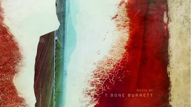
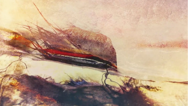
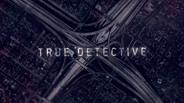
“The answer came in the form of some stunning aerial imagery from photographer David Maisel. His images captured the stunning golds, rust reds, rough textures and vivid hues of arid, mountainous Southern California. Beyond this, his high-contrast tangles of freeway interchange could serve as a metaphor for the complex, chaotic lives of these people crashing and falling apart.

“Maisel’s images became a key part of this years sequence, allowing us to once again create double exposure style imagery but now with a depth of texture and vivid color that made this a distinct and unique way for the audience to come back to True Detective.”

Client: HBO
Design Studio | Elastic
Creative Director | Patrick Clair
Lead Animation and Compositing | Raoul Marks
Animation and Compositing | David Do
Design | Patrick Clair, Paul Kim, Kevin Heo, Jeff Han
Associate Producer | Danny Hirsch
Producer | Carol Collins
Executive Producer | Jennifer Sofio Hall
Theme: “Nevermind” by Leonard Cohen
