ManvsMachine calls their latest abstract CG opus for Nike “a metaphorical exploration of air and the negative space it occupies.” Has footwear ever felt lighter, cushier, or more comfortable? Probably not.
MvsM creative director Adam Rowe: “The trickiest aspect of the project was one of quantity. Our aim was to visually overload the viewer with as many metaphors as possible. Catch 22 of this was that we had to produce a plethora of shots, many of which were completely different from one another.
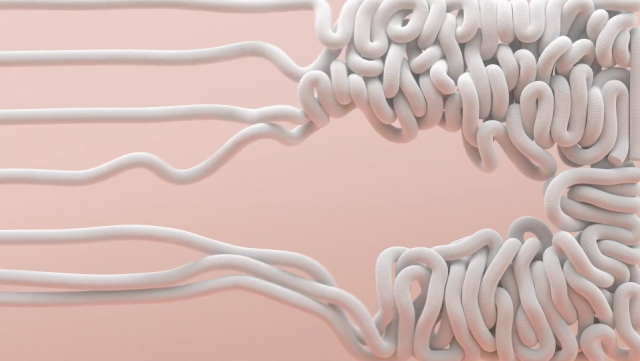
“In order to make this more manageable we were intending on working on scenes for slightly less time than we usually would — purely down to the fact that they were going to on screen for such a short amount of time – but, us being us, we ended up crafting every tiny detail to the nth degree on twice as many shots as normal.”
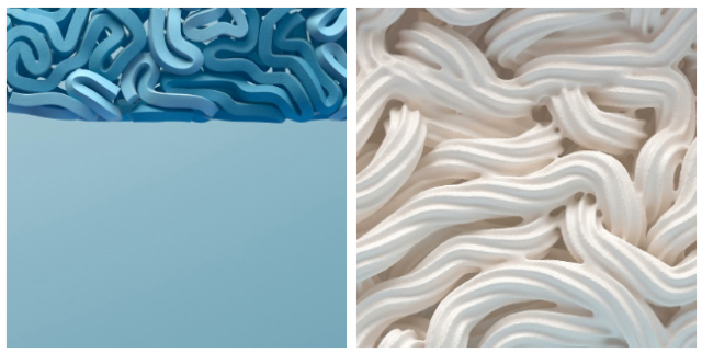
“We sorted our metaphors into various categories: the product itself, the urban running environment and pop culture. Each material had to convey either soft and cushioned or lightweight and breathable; better yet, both.
“The product itself gave us a wealth of forms and materials from which to take inspiration, as did the running terrain.
“Finally, as the Air Max 2017 is worn as a fashion shoe by many, it needed to connect with style as well as substance, so we injected some whimsical pop-led elements. Overall, the film is a lighthearted smack in the face – precisely what we were after.
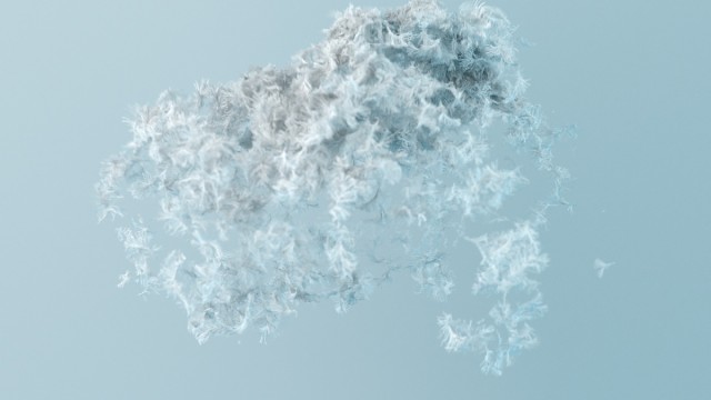
“Sound design is crucial to the film as it’s very much the driving force behind the flow. It represents an abstracted daily run and is composed of the rhythm of foot strikes, percussive traffic noises, sonic references to airflow and the runner’s breath.
“Our collaborators at Zelig recorded various footsteps, editing and re-pitching them, finally playing them musically to form the melody and rhythm of the piece.
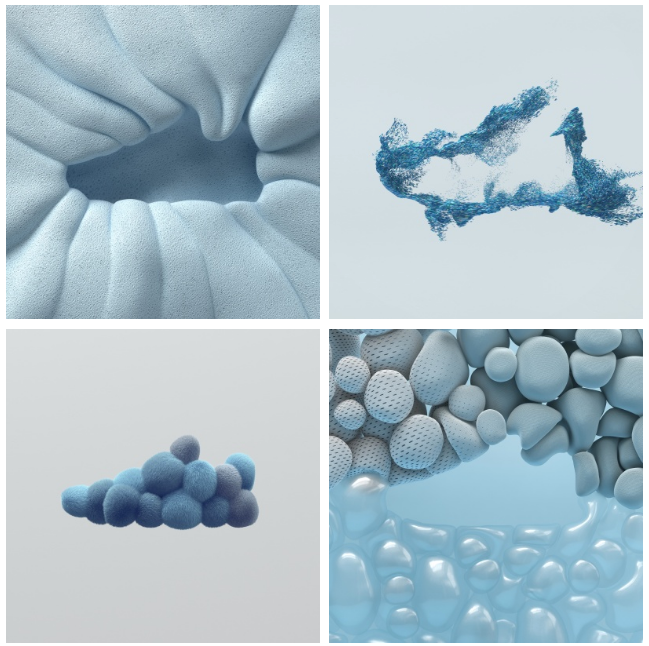
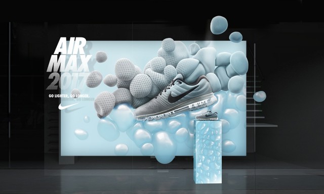
We took our cue from the R&D reels that we often create – collections of visual madness that comes out of the studio – that are always well-received. The editorial aim was to overwhelm the viewer, leaving them wanting more.
“But even though we wanted to pack the edit full, we had to keep it tightly knit so that it didn’t become messy or disjointed.
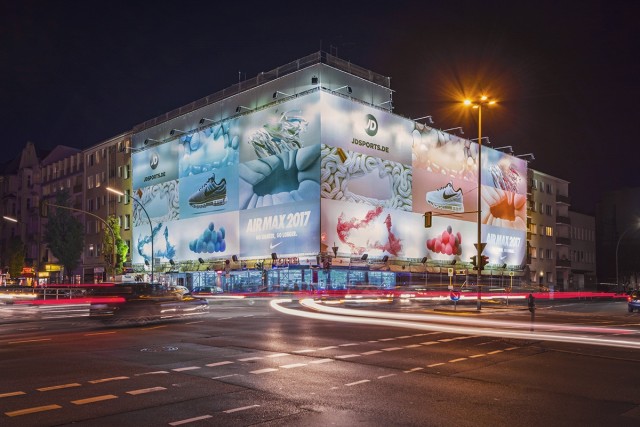
“Our palette of forms and textures all share the same world, but the primary unifying element is the negative space of the shoe itself. Its presence in all shots gave us the freedom to push our metaphors and still maintain consistency.”
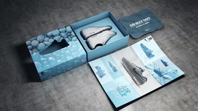
Concept, Design & Direction: ManvsMachine
Client: Nike Europe
Audio: Zelig
