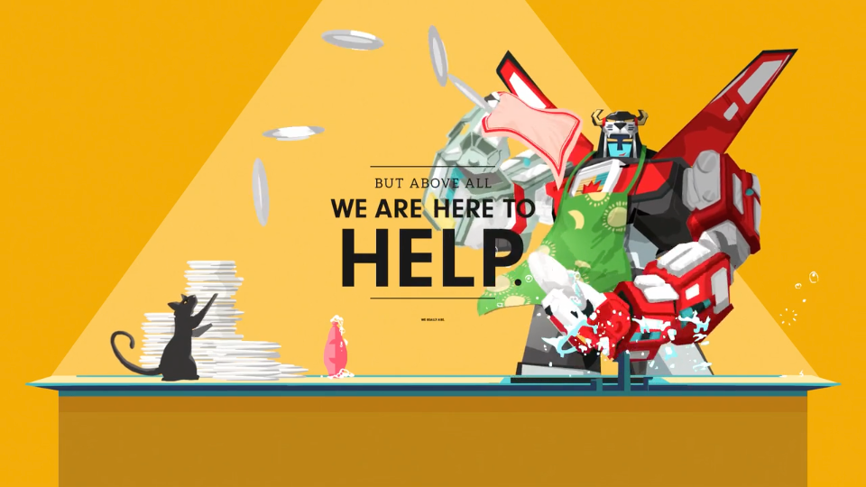
As the design world drowns in demo reels (invariably a string clips cut to music), what can a studio do to punch out of the noise and deliver a clearer picture of who they are? The company manifesto is a good start. Witness this snappy 90-sec romp created by We Are Royale timed for the launch of their new site and brand refresh going live today.
Brien Holman, We Are Royale partner/ECD: “Technically, we’ve always been ‘We Are Royale,’ but we wanted to own it in a more direct way. The name purposely reflects who we are as a company and how we collaborate as a team, internally and with clients, to serve the greater good.
“It’s about bringing everyone into our culture, and having fun in the process. This idea is expressed in our refreshed logo, where the crown finds its place at the heart of the typography, supported by the team that represents it.”
