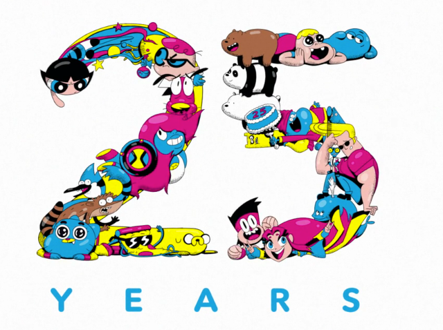
Cartoon Network just hit their 25th anniversary on the air and revealed the logo for occasion with this manic explosion of the network’s characters designed and directed by Benjy Brooke.
Designer/director Benjy Brooke: “The project started with a simple prompt: animate classic CN characters forming into the number 25.
“From there I started thinking about the characters trapped in a TV, and bursting out in a chaotic, celebratory explosion. The TV was eventually swapped for the CN cube, which features heavily in their current branding.
“The design phase was a breeze, my producers at CN were incredibly open to experimenting with form and getting weird with the style and rhythm. They only stipulated the cube, which characters we used in the 25, and the color palette — beyond those constraints, we got to go to town on the animation.
Style frames:
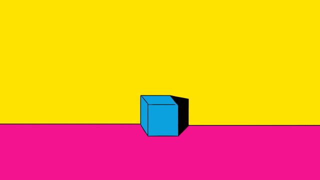
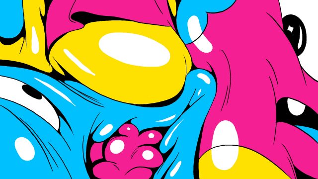
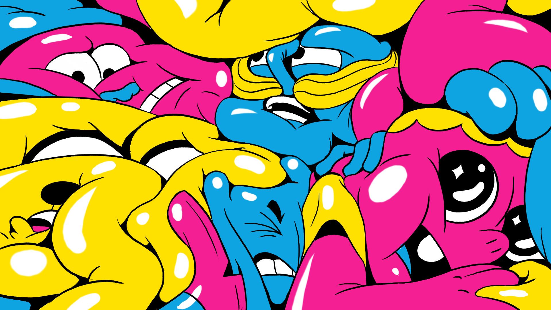
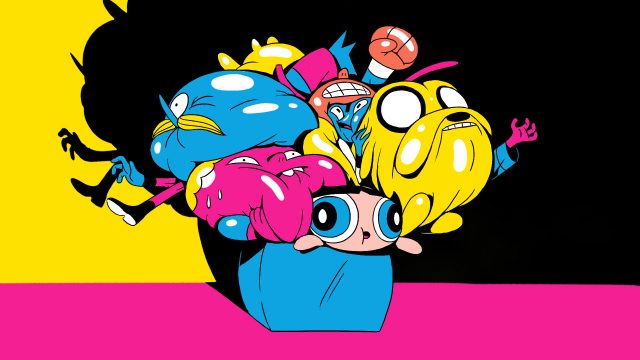
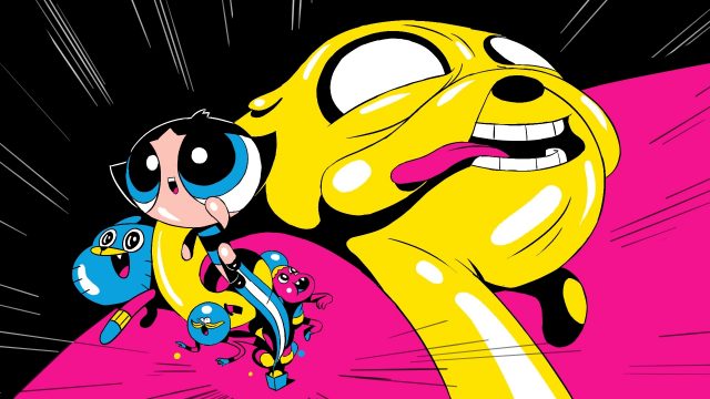
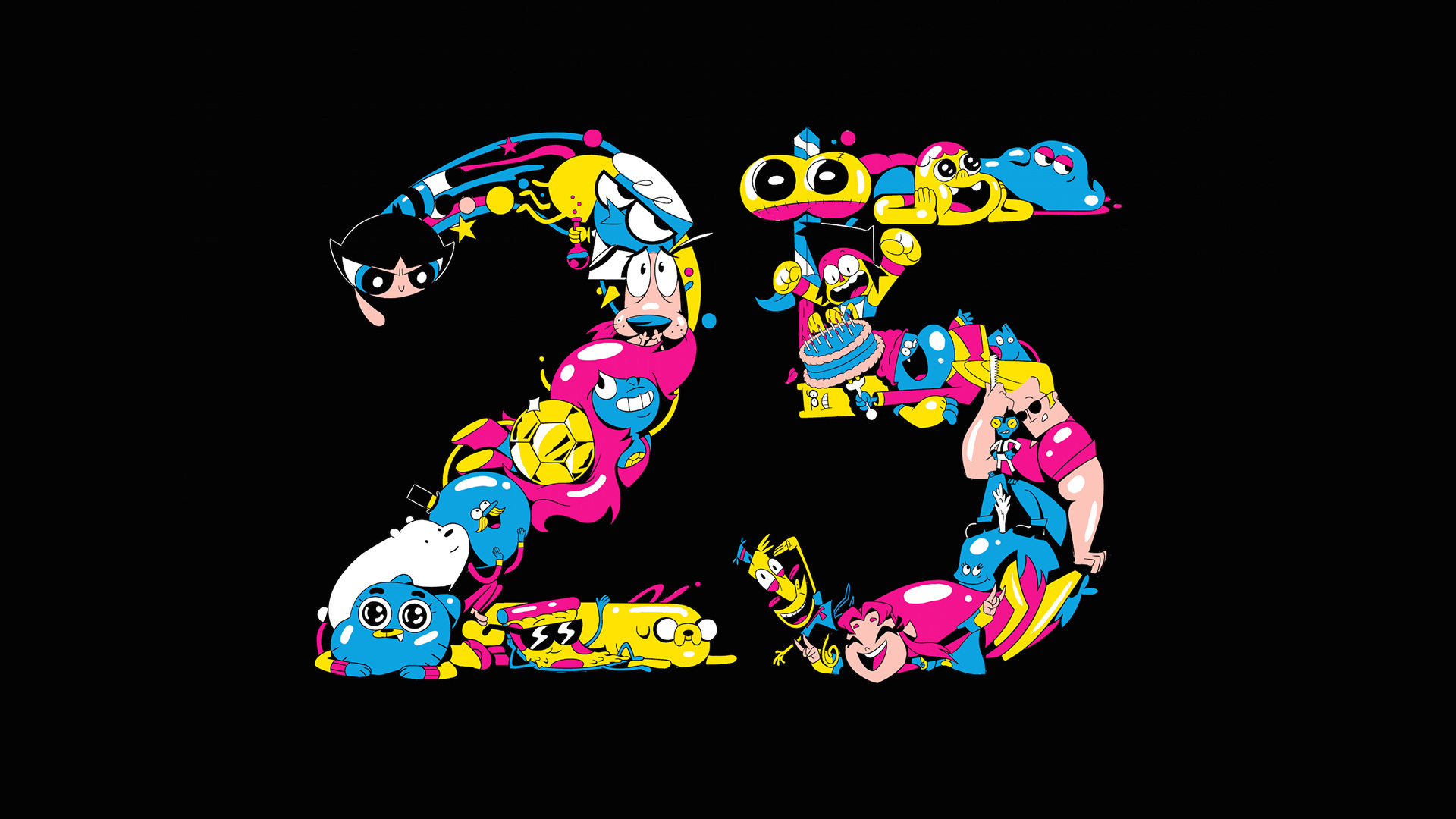
“The two biggest challenges Harry Teitelman (my co-animator) and I faced were how to distort and abstract the characters inside the box without losing sense of who they are (we wanted them to swell and stretch like bubblegum) and the immense challenge of actually forming the 25 with all of those characters.
“I foisted that second task onto Harry, and he spent nearly 1.5 months working on just five seconds of wild animation. Working with Harry is a dream, he’s got the Midas touch.
“One last shoutout to Kenny Kusiak, my old friend and go-to sound design collaborator. He always taps into the off-kilter side of my projects, and then elevates the composition to another level. I love the way he combined the goofy, the grotesque and the triumphant into this project’s sound design, a perfect fit for CN’s 25th anniversary.”
Design, Direction: Benjy Brooke
Animation: Benjy Brooke, Harry Teitelman
Sound: Kenny Kusiak
